
Video Outline
By watching the video outline on the Bing video detail page, users can easily learn the whole video's structure, quickly skim through the video and jump to a specific moment and gather the information they need from the video.
SUMMARY
During a previous usability study, the team collected some user requirements that users want a way to gather the whole video’s key information while they are watching the video, especially for informative and long videos. Also, they want the capability to skim through the video and jump to a specific moment.
By designing the video outline feature, we will provide a quick and easy tool for users to watch videos more efficiently.
The highlight of this project is how we define different user scenarios based on the user problem we obtained from early research, and provide different solutions for each scenario, but also keep the consistency within the feature.
1.0 EARLY RESEARCH FINDINGS
Obtain the pain points from user study
In the early user study on QnA segments, we found that 9/12 of participants agreed that for informative videos, It will be useful to gather the key information before they watch the whole video because it’s hard to find specific answers within a video especially when the video is long. The user also wants the ability to skim through the video and jump to a specific moment.
By looking through all the user feedback, we summarized the pain points of the current video watching experience:
It's hard to know if the video includes the content that the user wants.
" I would love to see a feature like that, like a table of contents or some kind of indication of the relevant parts of a video for me. I don’t expect this, but it would be an awesome feature."
Users have to finish watching the whole video to gather all the information.
Users spend too much time on finding the certain moment within the video
That would be a good feature if I need a certain section repeated it‘ll be easily accessible.
Competitor study to help evaluate the product assumption
By looking at the most popular video products we use every day, I found not only competitors but also some enterprise products from MS use a similar format to give users a quick brief about the information in the video. Those studies make us more confident about the observation of user needs.
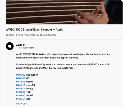
For many conference videos on Youtube, the publisher will summarize a timeline with the chapter’s description. Also, users often comment with timelines to help other people watch the video or draw interest in a section as well.

In an MS internal newsletter, the sender breaks a video into outlines to help the audience find the topic of interest.

Google recently also shipped video answers with a similar feature for a small number of videos.
2.0 THE PROBLEM
What's the user problem we want to solve?
In the current production, It takes users too much time to gather valuable information from the video, especially for long videos.
What do we want to provide users?
Efficiency

Users can instantly find out is this the correct video he wants to watch.
Users can easily gather the information without watching the whole video.
Users can quickly jump to the specific moment in which he’s interested.
Define scenarios
Before starting designing, we refined different user scenarios to help us better understand the user requirement and set the right product scope and priorities.
For v1, we choose 2 types of videos for this feature, interview videos, and slideshow videos.
Scenario A
Interview videos
Use cases
Content in video
news / talk show / events etc...
sentence includes question and answer
Scenario B
Slideshow videos
Use cases
online education / events / presentation etc...
Content in video
slide images
3.0 IDEATION
Focus on each scenario separately
After I knew clearly what problem we want to solve and the different scenarios, I started drawing some sketches and low-fi wireframes for both scenarios. Because for different types of video, the content inside and focusing spot of users will be different, I started to focus on each scenario separately to find the best design solution for them.
Displaying the outline on the right side of the video canvas seems a good choice because it won’t block users from watching the video, and provide the information very efficiently at the same time.

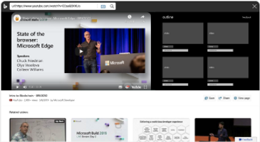
Wireframe of interview videos outline
Wireframe of slideshow videos outline
A - Interview videos
Feature scope
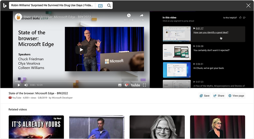
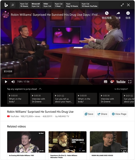
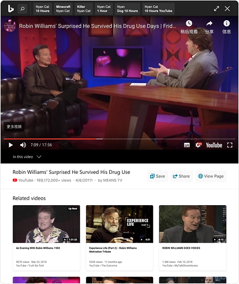
In interview videos, the contents are sentences that include questions and answers. Listing all the conversations like a script won’t help us reach the goal that helps users quickly find the information he’s interested in. Compare to the answers, questions usually are shorter, and easier to attract users’ interest. So we decided to extract every question from the video as the outline for interview videos.
Wireframe of slideshow videos outline
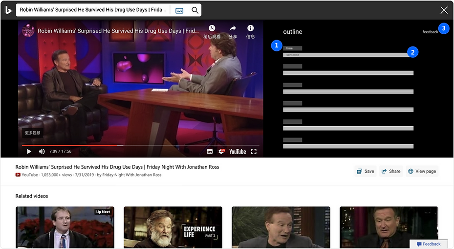
1. Timestamp for each question will help the user quickly learn the main structure of the video, also how long each question’s section is to finish. Click to jump to a certain time.
2. As we will extract the question list from the video as the outline, this will be the most important information we want to deliver to users. Users can click to jump to a certain time.
3. As all the questions will be generated by the machine, mistakes will happen sometimes. We want to borrow some help from users to improve the data’s quality by receiving feedback.
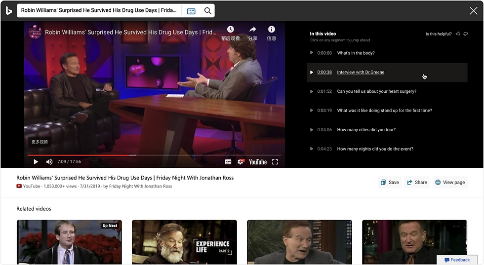
Final proposal for interview videos outline
After several rounds of design explorations, I did the following steps to improve the design:
-
Working with the writer and legal team on the strings to help users easily understand this new feature.
-
Distinguish the information’s priority by using different font colors, background colors, and different hovering statuses.
-
Provide more visual hints like a play icon to help users quickly learn how the feature works.
-
Refine the feedback workflow to save the user’s effort to send their feedback.
B - Slideshow videos
Feature scope
Before we get to the design stage, we want to refine the slideshow video’s scenarios to help us better understand the problems for each scenario, and the priority of the information we want to provide to users.

Slideshow videos
SLIDE WITH A LOT OF TEXT
Education / knowledge sharing slideshow
PROBLEM
Hard to read all the text in a small size thumbnail
SOLUTION
A short summary for each slide can be very helpful for users to gather the key information in both scenarios

USE CASES
SLIDE RARELY HAS TEXT
Events / conference slideshow
PROBLEM
Hard to understand the key point without text
USE CASES

Wireframe of slideshow videos outline
1. Extract an image caption of each slide to help users easily go through all the slides to learn the overall structure of the whole presentation, and also find their interest spot.
2. Help users get a brief idea of how long is each slide section.
3. User can understand each slide’s key subject very quickly just by reading the summary, especially for a slide which has more text.
Final proposal for interview videos outline
After several rounds of design explorations, I did the following steps to improve the design:
-
Move the summary next to the thumbnail for a better connection to help users quickly collect information inside the slides.
-
Changing to the list view to solve the reading order issue, and it's more aligned to the timeline concept so it's more convenient to go through all the slides.
-
Using the same elements from the interview videos outline design to keep different scenarios’ designs and behavior consistent.
4.0 RESPONSIVE DESIGN
For outline on a smaller screen, I made few changes:
-
Move the outline under the video player to avoid blocking the video content while user is watching.
-
More flexible to hide by adding an expand control, use carousel to save the vertical space for showing more video content.
-
As there’s no hover status on tablet and mobile, I used a button style treatment for each sentence so it looks more clickable.
-
Simplify the feedback control because the touch area is limited on small screen.
5.0 Takeaways
After we shipped the video outline, we found the engagement differs a lot based on the scenario, the interview CCR is 2.3% and the slides CCR is 10.5% Which could suggest the slides scenario resonates better with users. For video engaged, the user clicks average is 2.5 chapters.
Here are 2 takeaways I learned from this project:
-
Focus on the main scenarios first, and think differently for each scenario to provide the most suitable solution.
-
Think more about the different situations when designing for different screens, and make sure the solution is in line with the user habits when they use different devices.